

H2OH
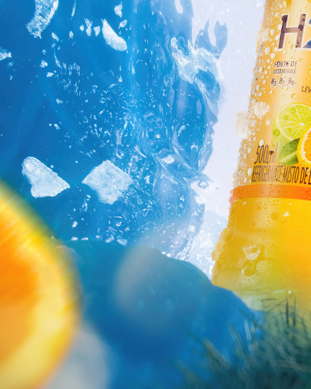
The scene I created presents the product as the main element and is divided into two different environments in the same scene: one side is an ice cave in blue tones, while the other side is an orange plantation.
I wanted to use the ice cave with blue tones to represent the purity and freshness that the orange flavor of H2OH offers. The choice of the blue color as the background is a reference to the feeling of freshness that the product provides, while the ice cave refers to the purity of the water, which is the main ingredient of the drink.
The orange plantation in the background represents the natural flavor and aroma of the fruit used in H2OH orange flavor, showing that the product is made with natural and high quality ingredients. To visually connect the ice grotto with the orange grove, I added a ripple effect to the transition between the two environments. This effect represents the union between freshness and naturalness, fundamental elements of the H2OH product.


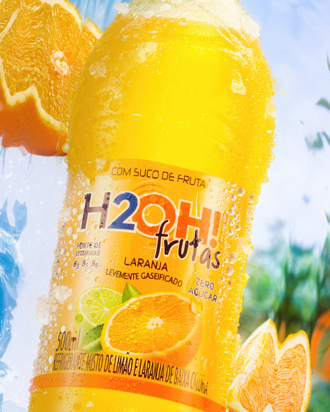

In summary, the scene I created demonstrates a unique visual connection between the product and the environment, conveying the message that H2OH orange flavor is made with natural, high-quality ingredients and provides a refreshing and tasty experience.
CREDITS
Bottle image: Lucas Rosa - Primeira Classe
Other assets: Adobe Stock
Other assets: Adobe Stock


